
- This topic has 2 replies, 2 voices, and was last updated 11 years, 9 months ago by
 Theme Horse Support Team.
-
AuthorPosts
-
October 3, 2014 at 1:04 am #17000
 tony_boslettParticipant
Hello, I have a static website (not using as a blog), with no sidebars, etc. and I’m using the narrow layout, so the main content area is 1038px. I would like the pages to stay fixed at the size when the browser is resized. So if browser width is resized to less than page width (1038), I want the horizontal scrollbar to appear. But what happens is that the page automatically shrinks (header image, content, etc.) and horizontal scrollbar doesn’t appear. Is there a way to fix the page width at 1038px using the Interface theme?
Thank You.
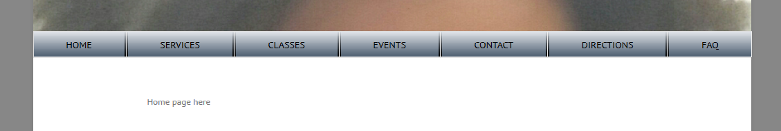
October 3, 2014 at 9:42 am #17013tony_boslettParticipanthere’s a followup to this question…what I’m basically trying to do is have a navigation menu that is full width across the container and renders nicely from desktop, ipad, or phone. A screen shot and the custom css I’m using are below. It looks fine from a desktop, with with an ipad, the last few menu items wrap to the next line, and with a phone, I just get the 3 horizontal lines. Any help would be greatly appreciated – I assume I’m doing something wrong with the css.
You can get to a screen snapshot of what I’m trying to do at: http://www.lisaboslett.com/horizontal_menu.png
Here’s the custom css
——————————–
#main .container {
min-height: 500px;
}#branding .hgroup-wrap .container .hgroup-right {
padding-right: 0px;
}.narrow-layout .container { width: auto; }
#branding .hgroup-wrap .container {
max-width: 100%;
}.page-title-wrap {
height: 0px;
display: none;
}.search-toggle {
display: none;
}#access ul {
display: table;
border-collapse: collapse;
width: 100%;
margin: 0;
padding: 0;
list-style: none;
}#access li {
display: table-cell;
width: 1%;
border: 1px solid #ddd;
background: #eee;
vertical-align: middle;
text-align: center;
}#access a {
display: block;
padding: 10px;
color: #000;
text-decoration: none;
height: auto;border-style: solid;
border-width: 0px 2px 0px 2px;
border-color: linear-gradient(#e0e4e9, #2b4f75);
background-image: linear-gradient(#e0e4e9, #4b5c6e);
-webkit-border-image:
-webkit-gradient(linear, 0 100%, 0 0, from(black), to(rgba(0, 0, 0, 0))) 1 100%;
-webkit-border-image:
-webkit-linear-gradient(bottom, black, rgba(0, 0, 0, 0)) 1 100%;
-moz-border-image:
-moz-linear-gradient(bottom, black, rgba(0, 0, 0, 0)) 1 100%;
-o-border-image:
-o-linear-gradient(bottom, black, rgba(0, 0, 0, 0)) 1 100%;
border-image:
linear-gradient(to top, black, rgba(0, 0, 0, 0)) 1 100%;
}#access ul li:first-child a { border-width: 0px 2px 0px 0px; }
#access ul li:last-child a { border-width: 0px 0px 0px 2px; }#access li {
margin: 0;
}#branding .hgroup-wrap .container .hgroup-right {
float: none;
}
nav#access {
float: none;
}
#access ul li { float: none; }
#access ul li a { float: none; }#access ul li:link > a { color: #000; }
#access ul li:visited > a { color: #000; }
#access ul li:hover > a { color: #fff; }
#access ul li:active > a { color: #000; }
#access ul li.current-menu-item a { color: #000; }October 7, 2014 at 3:38 pm #17197Theme Horse Support TeamKeymasterHi Tony_boslett,
To off the responsive view and have the same view as desktop. GO to Appearance -> Theme Options -> Layout Options Tab -> Responsive Layout click on Off radio button and click on save all changes button.
Thank you!
-
AuthorPosts
- You must be logged in to reply to this topic.